For geography professor Patrick Buckley and his team, maps are a tool to inspire social and legislative action.
When geography Professor Pat Buckley looks at a map, he sees not just lines and colors — he sees stories, opportunities for social change and futures ahead.
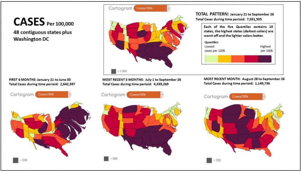
As COVID-19 cases began to ramp up across the U.S., Buckley took to a new digital mapping tool developed by researchers at Yale’s program at the National University of Singapore. His goal? To inspire action in citizens by encouraging them to applaud frontline workers when their COVID-19 cases are low and question public officials when cases are high.
Unlike maps, cartograms change or distort, familiar maps as a way of showing other data. For example, a cartogram illustrating the United States population might inflate New York City to represent its population of 8.39 million, and shrink Wyoming to show that its population is just over a half-million people.
In Buckley’s case, regions on the map with higher COVID-related death rates are inflated. Buckley’s ranking groups the 48 contiguous states and Washington, D.C. into fifths.
“The higher your ranking, the higher your risk is,” Buckley explained.
Soon, Buckley and his team began working with Michael Gastner, a Yale-National University of Singapore professor and the creator of cartogram mapping software go-cart.io. Go-cart.io has been used for electoral mapping and mapping worldwide gross domestic product, and as the go-cart.io website says, “we want to eliminate hurdles for non-experts.”
Using a combination of The New York Times’ data of COVID cases and Gastner’s mapping system, Buckley and his team of student researchers created maps designed to show where COVID-19 cases are and where the disease might head next.
Buckley and his team find The New York Times’ case data comprehensive, which is both an advantage and a disadvantage. As student researcher Liam Hanson notes, with 50,000 rows of state data and 4,000 counties in the country, they have over 400,000 pieces of data to sift through.
“The coronavirus is looking for opportunities, like water running downhill,” Buckley said.
As the U.S. begins to see a third wave, Buckley and his team have spotted a pattern — new cases are decreasing in the South and skyrocketing in the interior U.S.
For states that have the most cases, Buckley encourages residents to hold their leadership accountable. But he’s also quick to note that good leaders can make poor decisions, noting Washington Gov. Jay Inslee’s choice to wait until June to enact a statewide mask requirement.
“We have not had adequate leadership in many places,” Buckley said. “A good leader admits their mistakes, they look at the signs and they make a new choice."
In the coming months, Buckley and his team are hoping to expand their data to include animations, rankings of maps in the media and case breakdowns by county. This, he hopes, will empower Washington state residents to press their elected officials.
“It’s what we can do,” Buckley said. “What else are you gonna do if everybody is dead?”
How COVID deaths are classified
On social media, people report wildly different statistics for how likely a person infected with COVID-19 is to die. However, the data from health researchers remains consistent: Washington State’s Department of Health reports a 2% fatality rate amongst confirmed cases of COVID-19. Researchers at Johns Hopkins University currently report that the case-fatality rate for COVID in the U.S. is about 2.3%.
The Centers for Disease Control and Prevention notes that due to differences in reporting timeline and how deaths are classified, “death counts should not be compared across states.”
As the number of daily reported cases in the U.S. continues to rise, the CDC has released guides and online training modules for coroners, instructing them on how to classify a COVID-related death.
To test someone after they have died, the CDC recommends swabbing their nose, and also their lungs if an autopsy is conducted. If the tests are positive for COVID-19, they can report the death as a COVID-related death. A coroner can also report a death from COVID as “presumed” or “probable” based on symptoms alone.
Some have noted that this leaves gray areas, particularly in situations where the patient had co-occurring symptoms, such as COVID-19 and influenza at the same time, or in cases where patients with frail immune systems caught influenza after recovering from COVID-19 and died. Some critics have claimed that health care officials are baselessly inflating COVID-related death counts, although the CDC and the World Health Organization say this is a normal protocol for reporting on mortality in the U.S. and has been for 21 years.